MAM Pre-programme Assignment
 Gapminder Analysis
Task 1: gapminder country comparison
The gapminder dataset that has data on life expectancy, population, and GDP per capita for 142 countries from 1952 to 2007. Here is an overview of the dataset:
glimpse(gapminder)## Rows: 1,704
## Columns: 6
## $ country <fct> "Afghanistan", "Afghanistan", "Afghanistan", "Afghanistan", …
## $ continent <fct> Asia, Asia, Asia, Asia, Asia, Asia, Asia, Asia, Asia, Asia, …
## $ year <int> 1952, 1957, 1962, 1967, 1972, 1977, 1982, 1987, 1992, 1997, …
## $ lifeExp <dbl> 28.801, 30.332, 31.997, 34.020, 36.088, 38.438, 39.854, 40.8…
## $ pop <int> 8425333, 9240934, 10267083, 11537966, 13079460, 14880372, 12…
## $ gdpPercap <dbl> 779.4453, 820.8530, 853.1007, 836.1971, 739.9811, 786.1134, …head(gapminder, 20) # look at the first 20 rows of the dataframe## # A tibble: 20 x 6
## country continent year lifeExp pop gdpPercap
## <fct> <fct> <int> <dbl> <int> <dbl>
## 1 Afghanistan Asia 1952 28.8 8425333 779.
## 2 Afghanistan Asia 1957 30.3 9240934 821.
## 3 Afghanistan Asia 1962 32.0 10267083 853.
## 4 Afghanistan Asia 1967 34.0 11537966 836.
## 5 Afghanistan Asia 1972 36.1 13079460 740.
## 6 Afghanistan Asia 1977 38.4 14880372 786.
## 7 Afghanistan Asia 1982 39.9 12881816 978.
## 8 Afghanistan Asia 1987 40.8 13867957 852.
## 9 Afghanistan Asia 1992 41.7 16317921 649.
## 10 Afghanistan Asia 1997 41.8 22227415 635.
## 11 Afghanistan Asia 2002 42.1 25268405 727.
## 12 Afghanistan Asia 2007 43.8 31889923 975.
## 13 Albania Europe 1952 55.2 1282697 1601.
## 14 Albania Europe 1957 59.3 1476505 1942.
## 15 Albania Europe 1962 64.8 1728137 2313.
## 16 Albania Europe 1967 66.2 1984060 2760.
## 17 Albania Europe 1972 67.7 2263554 3313.
## 18 Albania Europe 1977 68.9 2509048 3533.
## 19 Albania Europe 1982 70.4 2780097 3631.
## 20 Albania Europe 1987 72 3075321 3739.Now that we know what the dataset is like, lets start off with a quick analysis of my home country the Netherlands:
country_data <- gapminder %>%
            filter(country == "Netherlands") # just choosing Greece, as this is where I come from

continent_data <- gapminder %>%
            filter(continent == "Europe")
Here we have a line plot showing how life expectancy in the Netherlands has changed since 1952. Life expectancy started at around 72 in 1952 and in 2007 it had grown to around 80.
plot1<- ggplot(country_data, aes(x=year, y=lifeExp)) + geom_point() +
  geom_smooth(se = FALSE) +
   labs(title = "Netherlands Life Expectancy over time",
       x = "Year",
       y = "Life Exepectancy")
plot1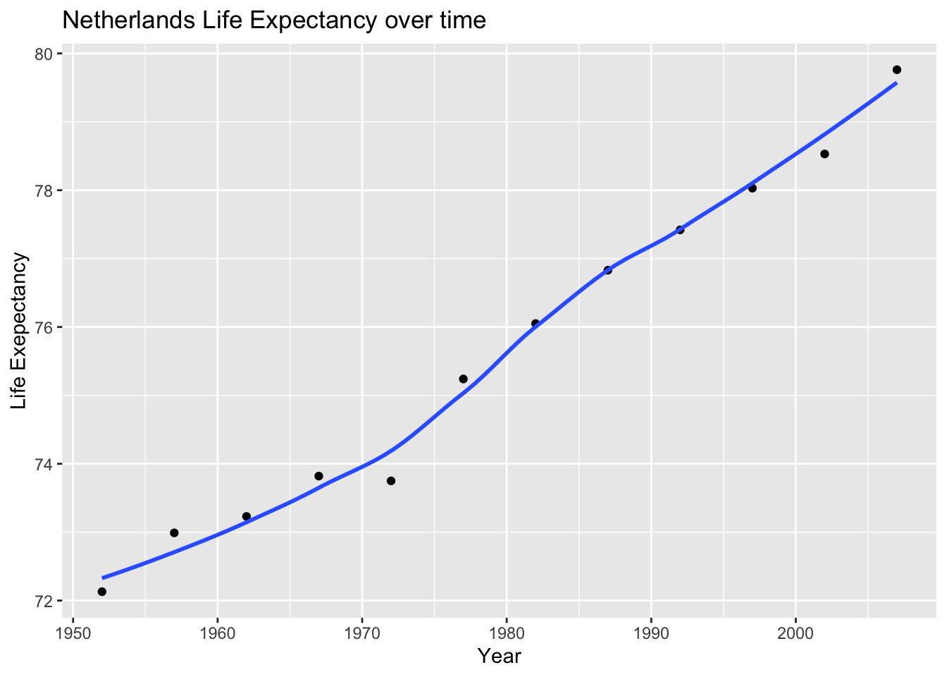
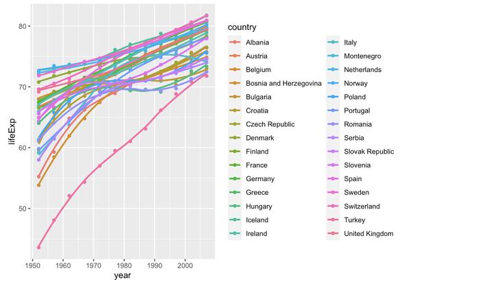
Now that we have analyzed the Netherlands life expectancy, lets see how it compares to the rest of Europe. As we can see, the Netherlands had one of the higher starting and ending life expectancies in Europe.
plot2<- ggplot(continent_data, mapping = aes(x =year  , y =lifeExp  , colour=country , group=country))+geom_point() + geom_smooth(se = FALSE)

plot2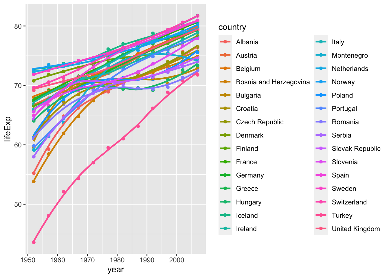
It is also interesting to see how all continents have evolved over time. Below we have a plot for every continent demonstrating the change in life expectancy for each continent. Each dot represents a life expectancy value for a country in a given year. The trend line shows the conditional mean of life expectancy in each continent over the years in our dataset.
 ggplot(data = gapminder , mapping = aes(x =year  , y =lifeExp  , colour=continent))+
   geom_point() +
  geom_smooth(se = FALSE) +
   facet_wrap(~continent) +
   theme(legend.position="none")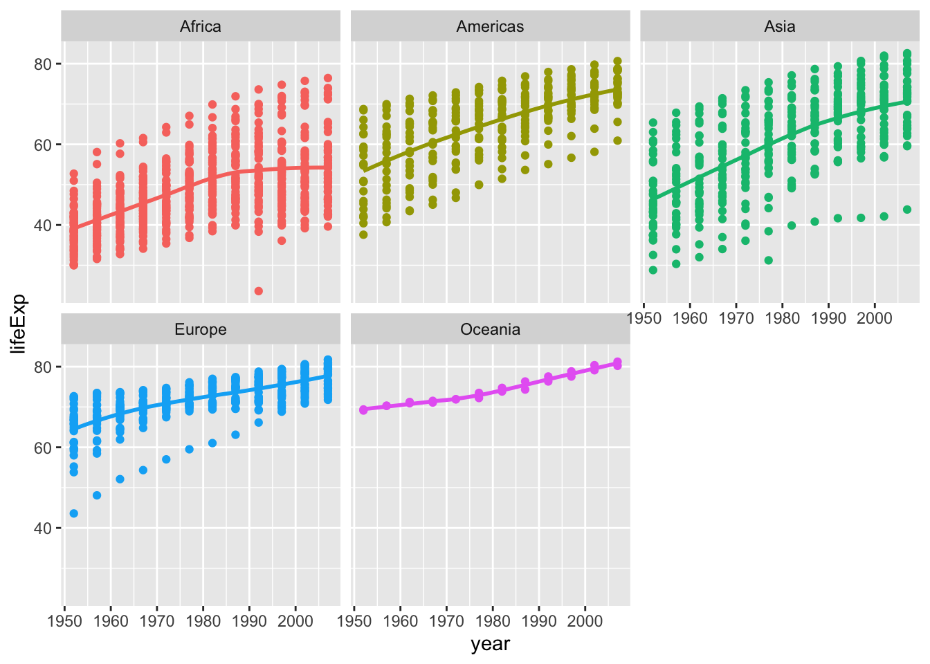
The data shows that since 1952 the average life expectancy in all continents has increased. This can be seen as all continents have a positive sloping trendline of life expectancy. The world has become a safer and healthier place due to advances in technology.
Certain continents, and countries within the respective continents, have higher life expectancies than others. This could be due to a variety of factors including economic position, political stability, health systems, lifestyle, culture and much more.
Task 2: Brexit vote analysis
Our goal here is to look at and analyse the 2016 Brexit vote in the UK.
brexit_results <- read_csv(here::here("content/project/preprogram/data1","brexit_results.csv"))


glimpse(brexit_results)
## Rows: 632
## Columns: 11
## $ Seat <chr> "Aldershot", "Aldridge-Brownhills", "Altrincham and Sale W…
## $ con_2015 <dbl> 50.592, 52.050, 52.994, 43.979, 60.788, 22.418, 52.454, 22…
## $ lab_2015 <dbl> 18.333, 22.369, 26.686, 34.781, 11.197, 41.022, 18.441, 49…
## $ ld_2015 <dbl> 8.824, 3.367, 8.383, 2.975, 7.192, 14.828, 5.984, 2.423, 1…
## $ ukip_2015 <dbl> 17.867, 19.624, 8.011, 15.887, 14.438, 21.409, 18.821, 21.…
## $ leave_share <dbl> 57.89777, 67.79635, 38.58780, 65.29912, 49.70111, 70.47289…
## $ born_in_uk <dbl> 83.10464, 96.12207, 90.48566, 97.30437, 93.33793, 96.96214…
## $ male <dbl> 49.89896, 48.92951, 48.90621, 49.21657, 48.00189, 49.17185…
## $ unemployed <dbl> 3.637000, 4.553607, 3.039963, 4.261173, 2.468100, 4.742731…
## $ degree <dbl> 13.870661, 9.974114, 28.600135, 9.336294, 18.775591, 6.085…
## $ age_18to24 <dbl> 9.406093, 7.325850, 6.437453, 7.747801, 5.734730, 8.209863…The data comes from Elliott Morris, who cleaned it and made it available through his DataCamp class on analysing election and polling data in R.
Our main outcome variable (or y) is leave_share, which is the percent of votes cast in favour of Brexit, or leaving the EU. Each row is a UK parliament constituency.
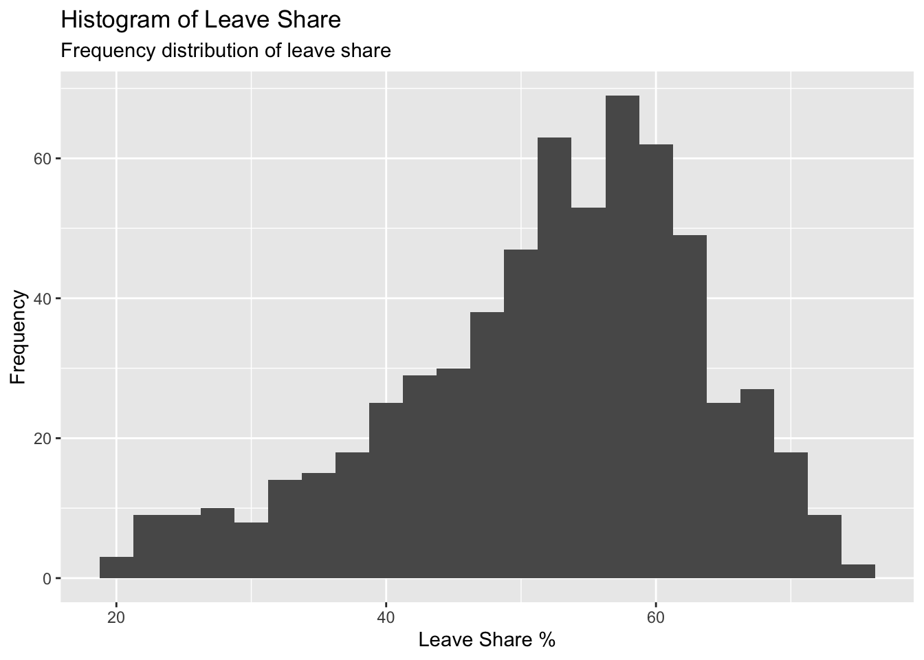
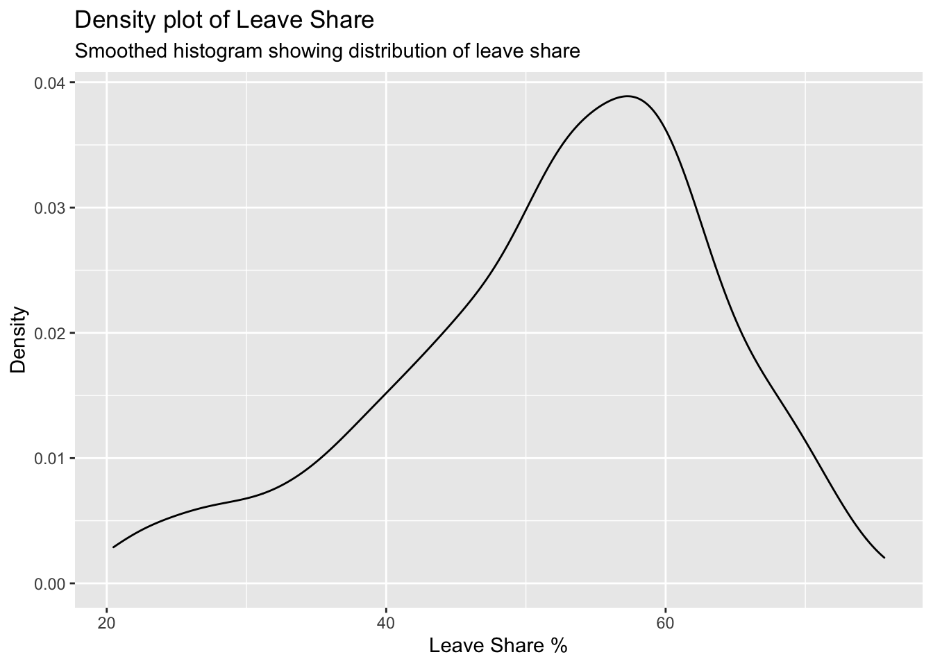
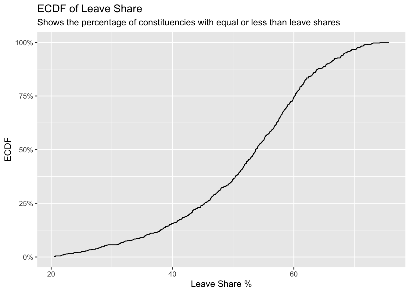
To get a sense of the spread, or distribution, of the data, we can plot a histogram, a density plot, and the empirical cumulative distribution function of the leave % in all constituencies.
# histogram
ggplot(brexit_results, aes(x = leave_share)) +
  geom_histogram(binwidth = 2.5) + labs(
    title = "Histogram of Leave Share",
    subtitle="Frequency distribution of leave share",
    x = "Leave Share %",
    y = "Frequency"
  )
# density plot-- think smoothed histogram
ggplot(brexit_results, aes(x = leave_share)) +
  geom_density() + labs(
    title = "Density plot of Leave Share",
    subtitle="Smoothed histogram showing distribution of leave share",
    x = "Leave Share %",
    y = "Density"
  )
# The empirical cumulative distribution function (ECDF)
ggplot(brexit_results, aes(x = leave_share)) +
  stat_ecdf(geom = "step", pad = FALSE) +
  scale_y_continuous(labels = scales::percent) + labs(
    title = "ECDF of Leave Share",
    subtitle="Shows the percentage of constituencies with equal or less than leave shares",
    x = "Leave Share %",
    y = "ECDF"
  )
One common explanation for the Brexit outcome was fear of immigration and opposition to the EU’s more open border policy. We can check the relationship (or correlation) between the proportion of native born residents (born_in_uk) in a constituency and its leave_share. To do this, let us get the correlation between the two variables:
brexit_results %>%
  select(leave_share, born_in_uk) %>%
  cor()
## leave_share born_in_uk
## leave_share 1.0000000 0.4934295
## born_in_uk 0.4934295 1.0000000The correlation is almost 0.5, which shows that the two variables are positively correlated.
To better visualise the relationship between born_in_uk and leave_share we can create a scatterplot:
ggplot(brexit_results, aes(x = born_in_uk, y = leave_share)) +
  geom_point(alpha=0.3) +

  # add a smoothing line, and use method="lm" to get the best straight-line
  geom_smooth(method = "lm") +

  # use a white background and frame the plot with a black box
  theme_bw() +  labs(
    title = "Scatterplot of Leave Share and Born in UK variables",
    subtitle="Used to see relationship between Leave vote and birth in UK",
    x = "Born in UK",
    y = "Leave Share %"
  )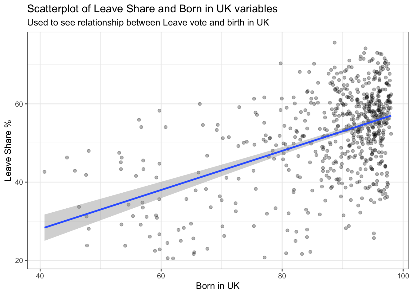
The scatterplot graphs the % of individuals born in the UK in each constituency vs the % of individuals that voted to leave the EU in each constituency.
The UK born population in a constituency is hypothesized to be an important predictor in leave share as UK born and bred individuals may have more nationalistic views and be more likely to want to leave the EU. This could mean that if a constituency has more UK born individuals it could have a greater percentage of leave share votes.
Fearing the open immigration policy in the EU and wanting to prevent this from diminishing British culture, British born individuals were more likely to vote to leave the EU. This can be seen due to the populated cluster of constituencies with a greater % of indiviudals born in the UK and a greater % of votes to leave. The scatter plot also has a positive sloped trendline. The positively sloped trendline shows the positive correlation between % Born in the UK and the Leave Share %.
Task 3: Animal rescue incidents attended by the London Fire Brigade
The London Fire Brigade attends a range of non-fire incidents (which we call ‘special services’). These ‘special services’ include assistance to animals that may be trapped or in distress. The data is provided from January 2009 and is updated monthly. A range of information is supplied for each incident including some location information (postcode, borough, ward), as well as the data/time of the incidents. We do not routinely record data about animal deaths or injuries.
Here we have an overview of the Animal Rescue Incidents dataset:
url <- "https://data.london.gov.uk/download/animal-rescue-incidents-attended-by-lfb/8a7d91c2-9aec-4bde-937a-3998f4717cd8/Animal%20Rescue%20incidents%20attended%20by%20LFB%20from%20Jan%202009.csv"

animal_rescue <- read_csv(url,
                          locale = locale(encoding = "CP1252")) %>%
  janitor::clean_names()


glimpse(animal_rescue)
## Rows: 7,873
## Columns: 31
## $ incident_number <dbl> 139091, 275091, 2075091, 2872091, 355309…
## $ date_time_of_call <chr> "01/01/2009 03:01", "01/01/2009 08:51", …
## $ cal_year <dbl> 2009, 2009, 2009, 2009, 2009, 2009, 2009…
## $ fin_year <chr> "2008/09", "2008/09", "2008/09", "2008/0…
## $ type_of_incident <chr> "Special Service", "Special Service", "S…
## $ pump_count <chr> "1", "1", "1", "1", "1", "1", "1", "1", …
## $ pump_hours_total <chr> "2", "1", "1", "1", "1", "1", "1", "1", …
## $ hourly_notional_cost <dbl> 255, 255, 255, 255, 255, 255, 255, 255, …
## $ incident_notional_cost <chr> "510", "255", "255", "255", "255", "255"…
## $ final_description <chr> "Redacted", "Redacted", "Redacted", "Red…
## $ animal_group_parent <chr> "Dog", "Fox", "Dog", "Horse", "Rabbit", …
## $ originof_call <chr> "Person (land line)", "Person (land line…
## $ property_type <chr> "House - single occupancy", "Railings", …
## $ property_category <chr> "Dwelling", "Outdoor Structure", "Outdoo…
## $ special_service_type_category <chr> "Other animal assistance", "Other animal…
## $ special_service_type <chr> "Animal assistance involving livestock -…
## $ ward_code <chr> "E05011467", "E05000169", "E05000558", "…
## $ ward <chr> "Crystal Palace & Upper Norwood", "Woods…
## $ borough_code <chr> "E09000008", "E09000008", "E09000029", "…
## $ borough <chr> "Croydon", "Croydon", "Sutton", "Hilling…
## $ stn_ground_name <chr> "Norbury", "Woodside", "Wallington", "Ru…
## $ uprn <chr> "NULL", "NULL", "NULL", "100021491149.00…
## $ street <chr> "Waddington Way", "Grasmere Road", "Mill…
## $ usrn <chr> "20500146.00", "NULL", "NULL", "21401484…
## $ postcode_district <chr> "SE19", "SE25", "SM5", "UB9", "RM3", "RM…
## $ easting_m <chr> "NULL", "534785", "528041", "504689", "N…
## $ northing_m <chr> "NULL", "167546", "164923", "190685", "N…
## $ easting_rounded <dbl> 532350, 534750, 528050, 504650, 554650, …
## $ northing_rounded <dbl> 170050, 167550, 164950, 190650, 192350, …
## $ latitude <chr> "NULL", "51.39095371", "51.36894086", "5…
## $ longitude <chr> "NULL", "-0.064166887", "-0.161985191", …One of the more useful things one can do with any data set is quick counts, namely to see how many observations fall within one category. We want to count the number of animal rescue incidents by year. This can be done by using count() or group_by() and summarise()
# animal_rescue %>%
#   dplyr::group_by(cal_year) %>%
#   summarise(count=n())

animal_rescue %>%
  count(cal_year, name="count")
## # A tibble: 13 x 2
## cal_year count
## <dbl> <int>
## 1 2009 568
## 2 2010 611
## 3 2011 620
## 4 2012 603
## 5 2013 585
## 6 2014 583
## 7 2015 540
## 8 2016 604
## 9 2017 539
## 10 2018 610
## 11 2019 604
## 12 2020 758
## 13 2021 648It is also interesting to see the number of incidents by animal group to analyse which animals are rescued more frequently.
# animal_rescue %>%
#   group_by(animal_group_parent) %>%
#
#   #group_by and summarise will produce a new column with the count in each animal group
#   summarise(count = n()) %>%
#
#   # mutate adds a new column; here we calculate the percentage
#   mutate(percent = round(100*count/sum(count),2)) %>%
#
#   # arrange() sorts the data by percent. Since the default sorting is min to max and we would like to see it sorted
#   # in descending order (max to min), we use arrange(desc())
#   arrange(desc(percent))
#
#
animal_rescue %>%

  #count does the same thing as group_by and summarise
  # name = "count" will call the column with the counts "count" ( exciting, I know)
  # and 'sort=TRUE' will sort them from max to min
  count(animal_group_parent, name="count", sort=TRUE) %>%
  mutate(percent = round(100*count/sum(count),2))
## # A tibble: 28 x 3
## animal_group_parent count percent
## <chr> <int> <dbl>
## 1 Cat 3783 48.0
## 2 Bird 1631 20.7
## 3 Dog 1230 15.6
## 4 Fox 373 4.74
## 5 Unknown - Domestic Animal Or Pet 201 2.55
## 6 Horse 195 2.48
## 7 Deer 136 1.73
## 8 Unknown - Wild Animal 94 1.19
## 9 Squirrel 68 0.86
## 10 Unknown - Heavy Livestock Animal 50 0.64
## # … with 18 more rowsIt is strange to note that there are some cases with unknown animals. In addition, Cat, Bird, Dog and Fox make up the majority of all cases (~80%).
Finally, let us have a look at the notional cost for rescuing each of these animals. As the LFB says,
Please note that any cost included is a notional cost calculated based on the length of time rounded up to the nearest hour spent by Pump, Aerial and FRU appliances at the incident and charged at the current Brigade hourly rate.
There is two things we will do:
- Calculate the mean and median
incident_notional_costfor eachanimal_group_parent - Plot a boxplot to get a feel for the distribution of
incident_notional_costbyanimal_group_parent.
Before we go on, however, we need to fix incident_notional_cost as it is stored as a chr, or character, rather than a number.
# what type is variable incident_notional_cost from dataframe `animal_rescue`
typeof(animal_rescue$incident_notional_cost)
## [1] "character"# readr::parse_number() will convert any numerical values stored as characters into numbers
animal_rescue <- animal_rescue %>%
# we use mutate() to use the parse_number() function and overwrite the same variable
mutate(incident_notional_cost = parse_number(incident_notional_cost))
# incident_notional_cost from dataframe `animal_rescue` is now 'double' or numeric
typeof(animal_rescue$incident_notional_cost)## [1] "double"Now that incident_notional_cost is numeric, let us quickly calculate summary statistics for each animal group.
animal_rescue %>%

  # group by animal_group_parent
  group_by(animal_group_parent) %>%

  # filter resulting data, so each group has at least 6 observations
  filter(n()>6) %>%

  # summarise() will collapse all values into 3 values: the mean, median, and count
  # we use na.rm=TRUE to make sure we remove any NAs, or cases where we do not have the incident costs
  summarise(mean_incident_cost = mean (incident_notional_cost, na.rm=TRUE),
            median_incident_cost = median (incident_notional_cost, na.rm=TRUE),
            sd_incident_cost = sd (incident_notional_cost, na.rm=TRUE),
            min_incident_cost = min (incident_notional_cost, na.rm=TRUE),
            max_incident_cost = max (incident_notional_cost, na.rm=TRUE),
            count = n()) %>%

  # sort the resulting data in descending order. You choose whether to sort by count or mean cost.
  arrange(-mean_incident_cost)
## # A tibble: 16 x 7
## animal_group_parent mean_incident_co… median_incident_… sd_incident_cost
## <chr> <dbl> <dbl> <dbl>
## 1 Horse 740. 596 541.
## 2 Cow 599. 436 451.
## 3 Unknown - Wild Animal 416. 333 322.
## 4 Deer 415. 333 282.
## 5 Unknown - Heavy Livesto… 374. 260 263.
## 6 Fox 374. 328 205.
## 7 Snake 356. 339 105.
## 8 Dog 347. 298 168.
## 9 Bird 344. 328 134.
## 10 Cat 344. 326 160.
## 11 Unknown - Domestic Anim… 326. 295 116.
## 12 cat 324. 290 94.1
## 13 Hamster 315. 290 95.0
## 14 Squirrel 314. 326 56.7
## 15 Ferret 309. 333 39.4
## 16 Rabbit 309. 326 32.2
## # … with 3 more variables: min_incident_cost <dbl>, max_incident_cost <dbl>,
## # count <int>From looking at the mean and median incident costs we can see:
There are two potential outliers of animal groups, which are Horses and Cows with mean costs of 739.5 and 633.8571 respectively.
It is interesting to note that the mean cost for almost all other types of animals incidents is in the range of 420 to 300 pounds.
Comparing the medians and the means, we can see that most animal groups have higher mean costs than median costs, potentially due to instances where rescue costs were abnormally high. This has the effect of increasing the mean cost.
Finally, let us plot a few plots that show the distribution of incident_cost for each animal group.
# base_plot
base_plot <- animal_rescue %>%
  group_by(animal_group_parent) %>%
  filter(n()>6) %>%
  ggplot(aes(x=incident_notional_cost))+
  facet_wrap(~animal_group_parent, scales = "free")+
  theme_bw()

base_plot + geom_histogram()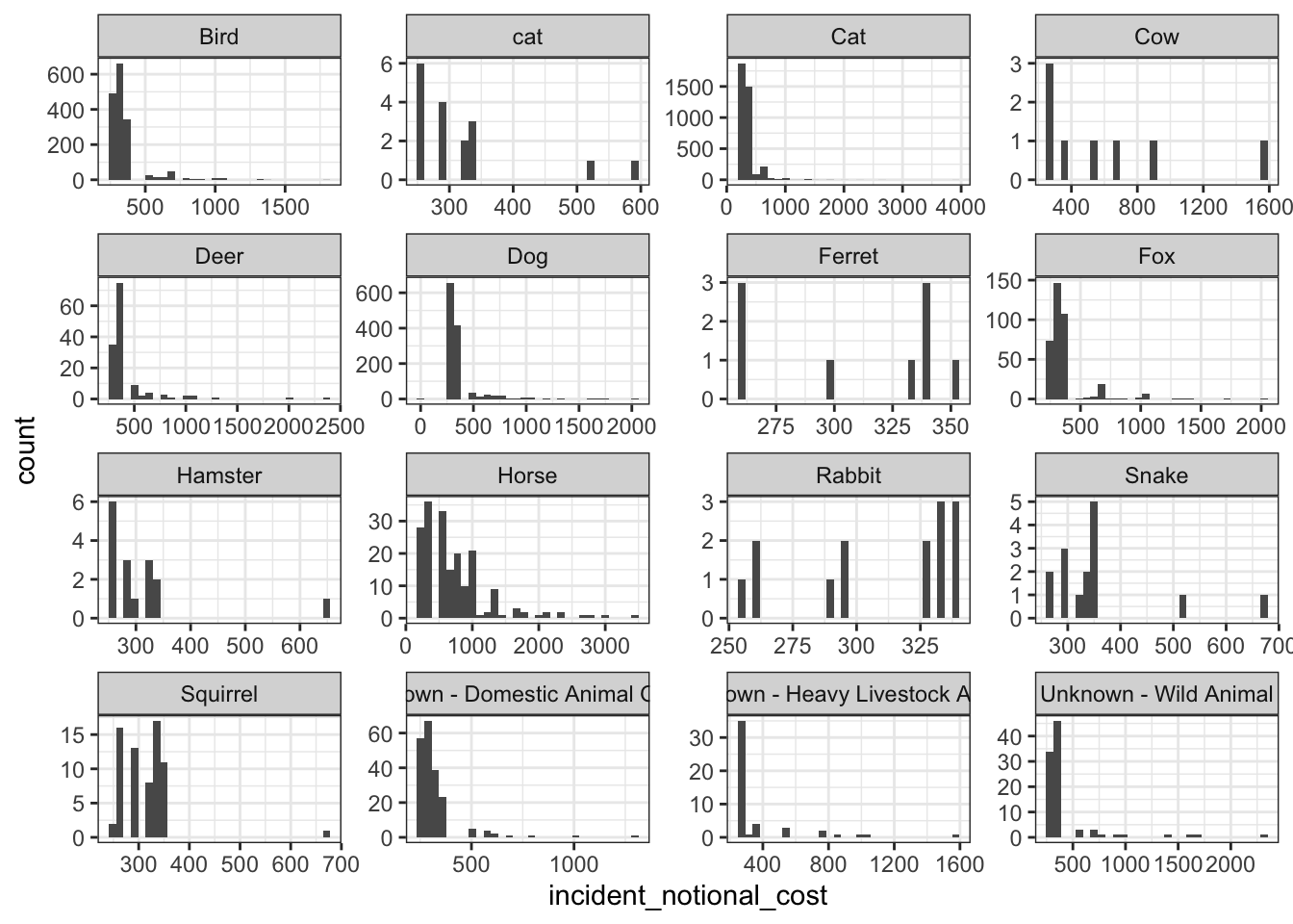
base_plot + geom_density()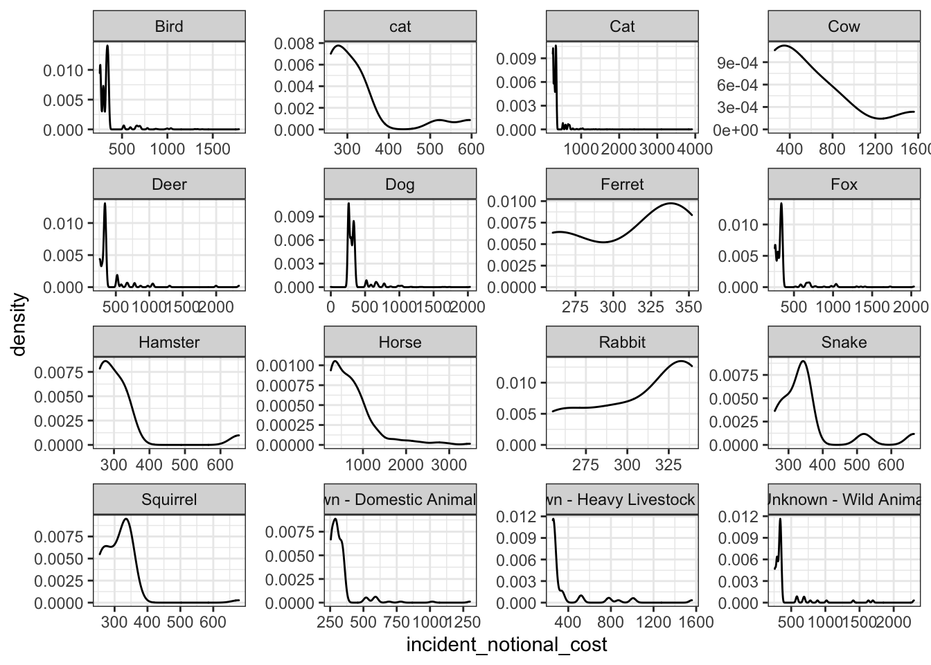
base_plot + geom_boxplot()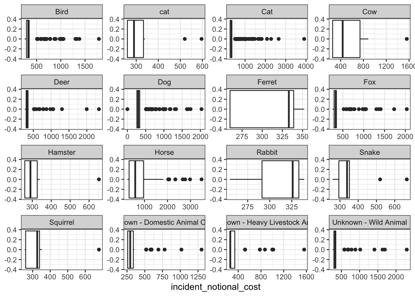
base_plot + stat_ecdf(geom = "step", pad = FALSE) +
  scale_y_continuous(labels = scales::percent)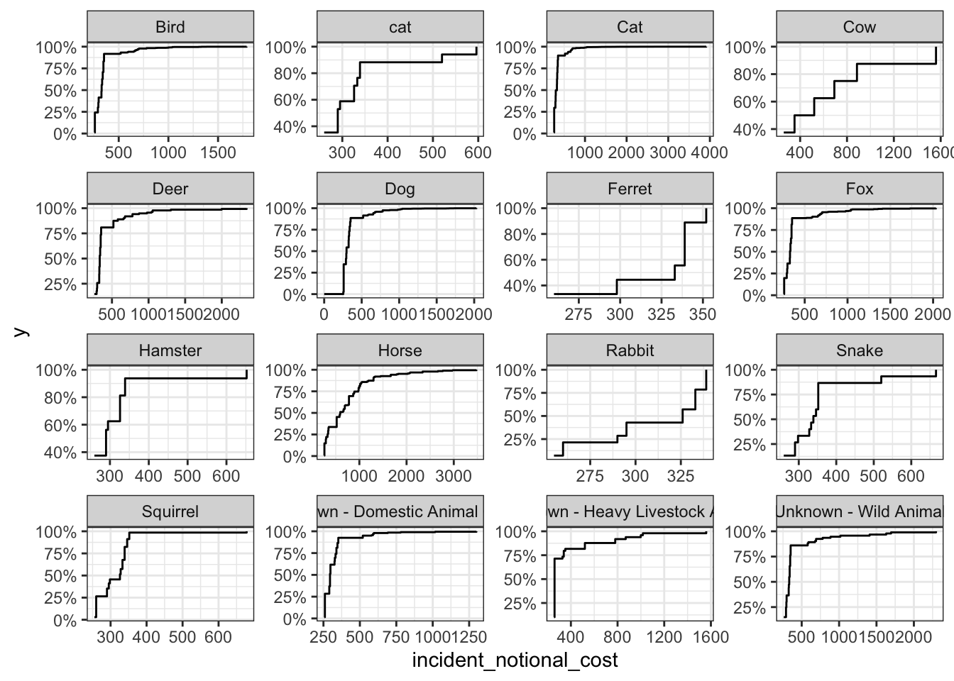
In my opinion, the Box Plots best communicate the variability of the incident_notional_cost values. This is because it shows the median of all the different animal groups as well as the outliers. It can be seen that the medians vary for each group and some groups have more outliers than others.
The cows, deers, horses and unknown wild animals seem to be the most expensive animals to rescue. Cows, deers and horses are some of the heaviest animals on the list. Due to this it could require more staff and/or more Pump, Aerial and FRU appliances to control and rescue the heavier animals. The more resources used and the more time spent intuitively leads to higher incidental costs. The Wild Animals also could require more time and resources as they are not domesticated. This may cause the wild animals to flee, hide or create more damage as they are not used to being around humans. The animal groups mentioned start the x axis at a higher cost than other groups showcasing their higher cost distribution.